Brand Identity & Development
1. Brand Manifesto
At GoySite, we believe that digital presence is not merely about aesthetics; it is about structure, intelligence, and function. In a world saturated with noise, clarity is a luxury. We provide that clarity through precise geometry, sophisticated design, and a relentless focus on smarter workflows. We don’t just build websites; we engineer digital ecosystems that empower our clients to Design Better, Work Smarter.
Our aesthetic is born from the intersection of contemporary luxury and futuristic structure. It is dark, tactile, and mathematically precise, reflecting the complex problems we solve with elegant solutions.
2. Brand Core
Brand manifesto
To elevate the digital landscape by merging high-end aesthetics with intelligent functionality, providing businesses with tools that are as efficient as they are beautiful.
The Value Proposition
GoySite delivers premium web development, UI/UX design, and branding services that move beyond the superficial. We offer multifaceted solutions rooted in strategy and innovation.
The Taglines
- Primary (English): Design Better Work Smarter
- Primary (Mongolian): Та гоё Вэбсайт – тай болмоор байна уу? (Do you want to have a nice website?)
- Secondary: This is what We do best
3. Visual Identity System (VIS)
The GoySite visual identity is characterized by high contrast, geometric precision, and luxurious textures.
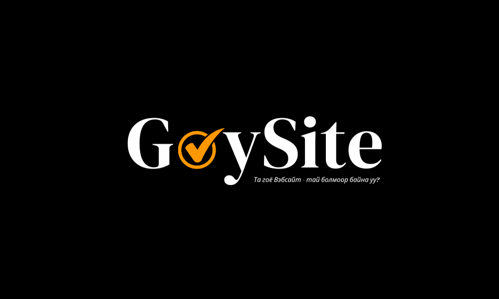
A. The Logomark
The GoySite logo is a synthesis of modern typography and a symbolic icon. The ‘o’ incorporates a checkmark, symbolizing completion, quality approval, and the “correct” choice.
- Primary Usage: The full logomark should be used in high-contrast situations.
- Variations: The identity includes full-color (black/orange), monochrome black, and monochrome grey versions to suit various backgrounds and printing techniques.
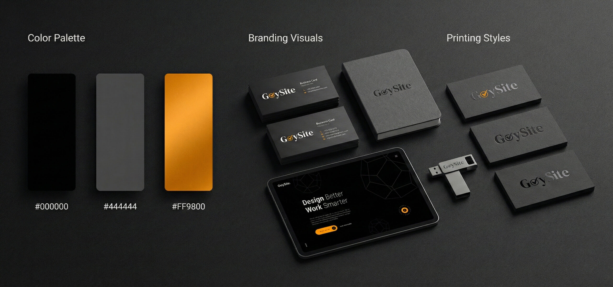
B. Color Palette
The palette is dominated by deep, matte tones punctuated by a vibrant, metallic orange signifying innovation and energy.
- Matte Black (Primary Background): Sets a premium, cinematic tone.
- Bold Grey (Secondary/Text): Provides sophisticated contrast without the harshness of pure white.
- Matte Orange / Metallic Orgn (Accent): Used for the checkmark icon, calls-to-action (CTAs), and highlights. Hex: #FF9900.
C. Typography
GoySite utilizes a clean, modern sans-serif typeface. It is bold and authoritative in headers (“Design Better Work Smarter”) and highly legible in body copy, maintaining a professional and contemporary feel across digital and print.

D. The Geometric Motif: The Dodecahedron
The central graphic element of the brand is the dodecahedron. This twelve-faced geometric shape represents complexity, multifaceted solutions, and structural integrity.
- Wireframe Application: Used as subtle background patterns on websites, business cards, and packaging, suggesting blueprinting and architecture.
- Solid Application: Used as a bold, sculptural element, rendered in matte orange or black steel to convey substance and tangible reality.
E. Imagery and Persona
The brand’s photographic style is cinematic, utilizing dramatic, low-key lighting. The brand persona is represented by a confident, sophisticated figure in sharp tailoring, embodying authority, intelligence, and a forward-thinking mindset. This imagery is used to humanize the brand’s high-level consulting and strategy services.
4. Brand Application & Development
The true power of the GoySite identity lies in its consistent application across diverse mediums, always maintaining a “matte luxury” and “noise texture” finish.
A. Digital Presence (Web & Mobile)
The digital experience is dark-mode default. It features clean lines, wireframe geometric backgrounds, and prominent use of the orange accent for interactive elements like buttons and scroll indicators. The interface is designed to feel immersive and high-tech.
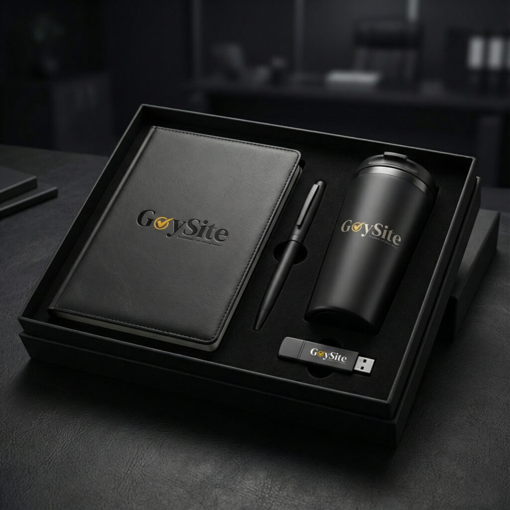
B. Corporate Stationery & Merchandise
Physical touchpoints must reflect the brand’s premium nature.
- Executive Set: Luxury PU leather notebooks with embossed logos, matte metal pens, thermal mugs, and branded USB drives presented in custom silk-lined boxes.
- Business Cards: utilizing heavy cardstock with varying finishes such as matte coating, spot UV gloss on black-on-black elements, and orange foil stamping for high impact.
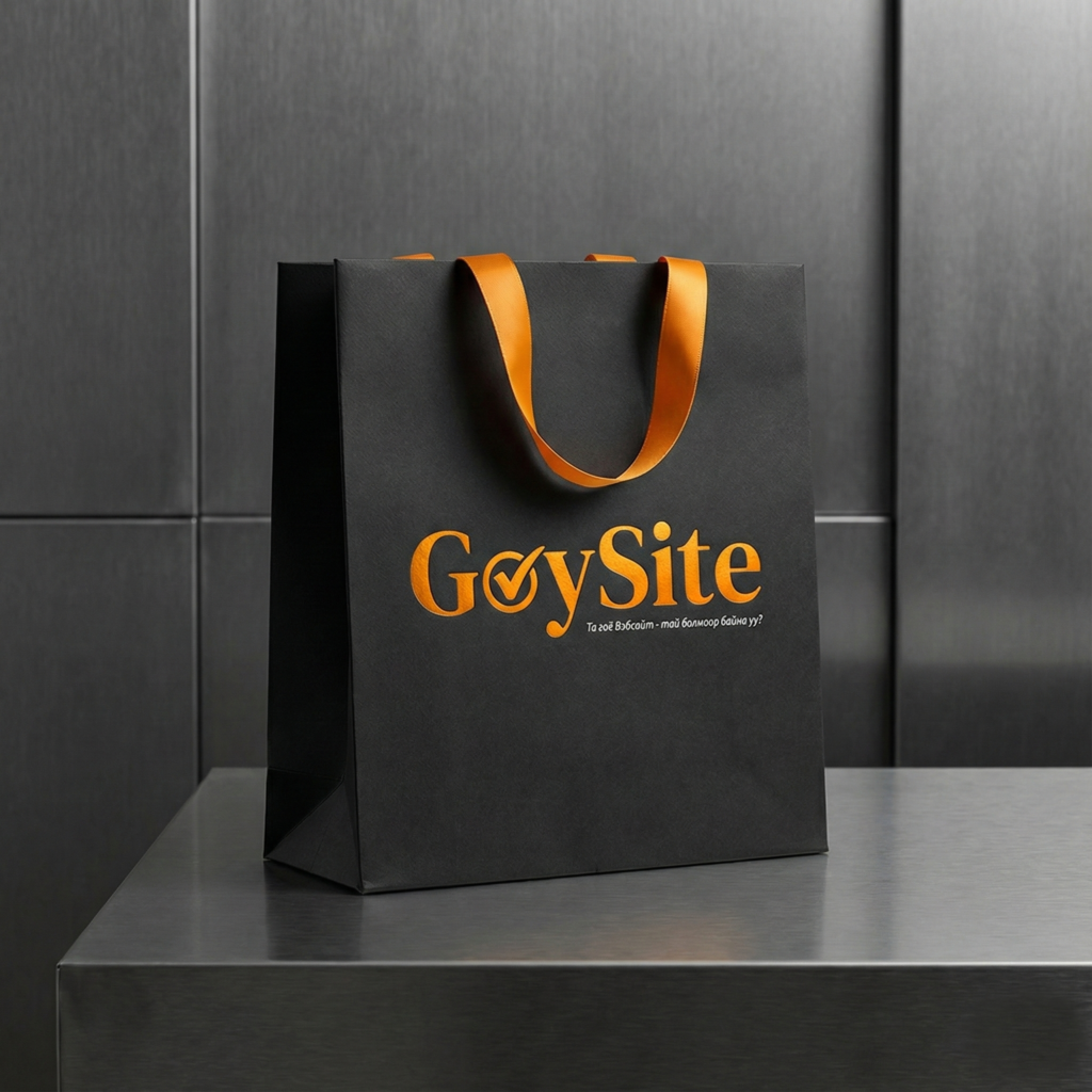
C. Packaging & Environmental
- Shopping Bags: Matte black thick paper bags with bright orange silk ribbon handles and embossed orange foil branding, creating a luxurious unboxing experience.
- Experimental/Urban: The brand is adaptable enough for edgy applications, such as weathered skateboard decks, proving its relevance in contemporary design culture.
- Futuristic Vision: Conceptual applications, such as cyberpunk-inspired posters, reinforce the brand’s commitment to future-forward design and innovation.
Very well presented. Every quote was awesome and thanks for sharing the content. Keep sharing and keep motivating others. lüleburgaz nakliye firmaları